Odense Robotics
Challenge
The Odense Robotics website served multiple audiences but lacked clarity in both structure and communication. Analytics showed that users primarily engaged with members and activities, while key services were underutilised. At the same time, both users and internal stakeholders found it difficult to understand the organisation’s full value and navigate the site effectively. This created friction in both discovery and engagement.
Role
I was responsible for the research and structural groundwork of the project. This included analysing website data, conducting interviews with members and stakeholders, and mapping user needs and value propositions. Based on this, I developed the information architecture and content structure that formed the foundation for the new website. The final design was developed externally, but built on the strategic direction I contributed to. I also participated in early alignment meetings, which gave insight into how UX strategy is translated into final design decisions.
Research & Insights
To understand user behaviour and identify opportunities, I combined analytics data with qualitative insights from interviews and internal feedback. The analysis showed that users primarily engaged with members and activities, while services received limited attention. At the same time, the value proposition was not clearly communicated, making it difficult for users to understand what Odense Robotics offers and why it is relevant to them. Another key insight was that members were underexposed. This highlighted a clear opportunity to make them a central part of the experience and strengthen both discoverability and credibility.

Structure
Based on these insights, I redefined the site structure to better support how users actually navigate and explore the platform.
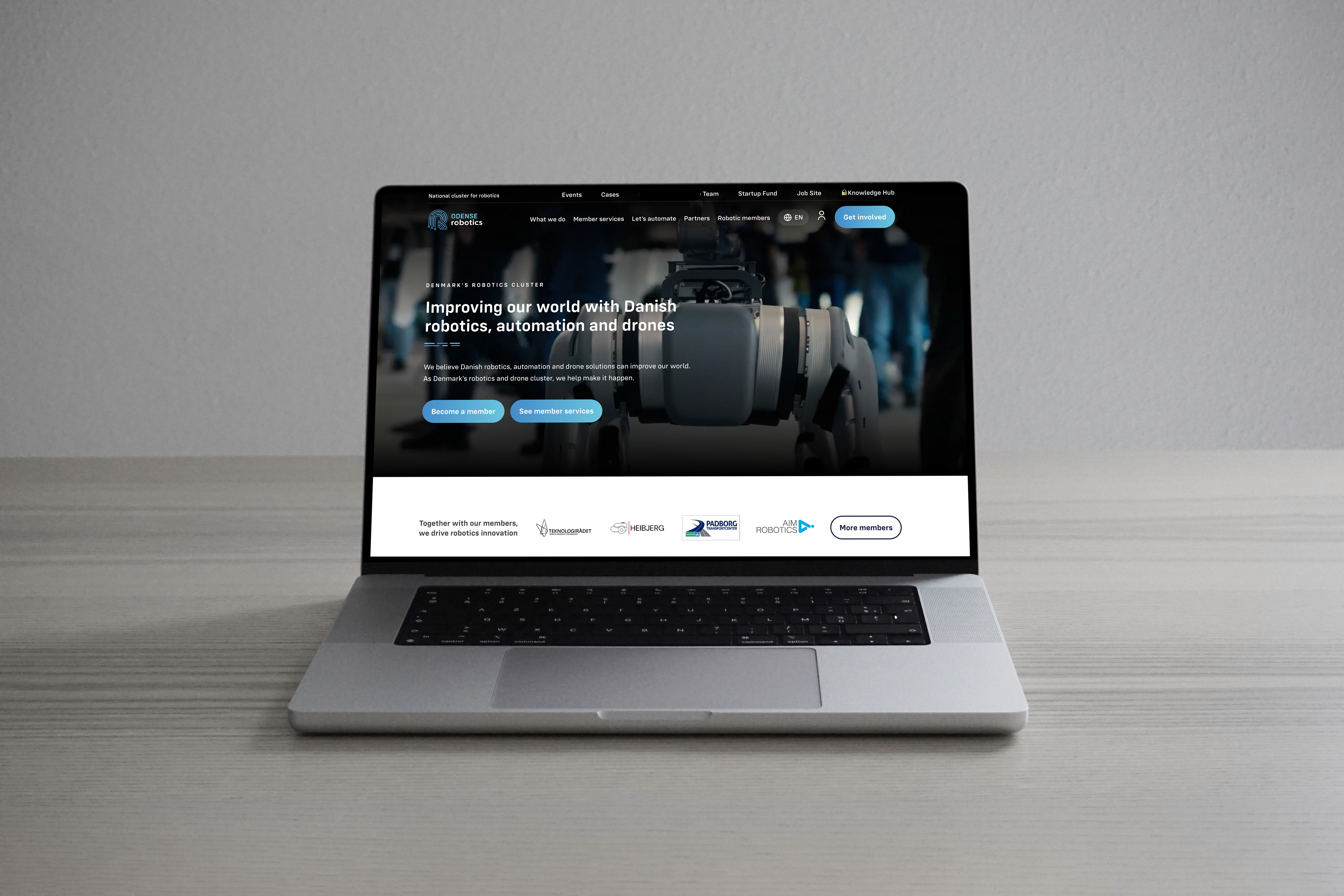
Since users primarily engaged with members, a searchable member directory with filtering was introduced to improve discoverability. To address the low engagement with services, the structure was adjusted to make them more visible and easier to understand in relation to user needs. To clarify the value proposition, the content was reorganised to better communicate what Odense Robotics offers and how it creates value. Members were also given a more prominent role across the site through increased visibility and stronger integration into the overall experience.
The result was a structure that aligns user behaviour with business goals and creates a clearer and more intuitive navigation flow.


Design Direction
The design focused on translating the new structure into a clear and usable experience. Wireframes were developed to define layout, hierarchy and navigation before moving into final design.
To improve the first impression and better communicate the organisation’s value, I also created a new hero video based on selected footage aligned with user needs and messaging. This replaced a static landing experience and helped communicate the ecosystem more effectively from the first interaction.

Outcome
The project resulted in a clearer and more scalable foundation for the website. The new structure improved navigation, strengthened the focus on members and activities, and made the value proposition more understandable.
It established a solid base for future development and made it easier to expand and manage content going forward.

Reflection
This project strengthened my ability to translate research and insights into concrete structural decisions. It also gave me insight into how strategic UX work connects with external teams and final implementation, from early analysis to execution.